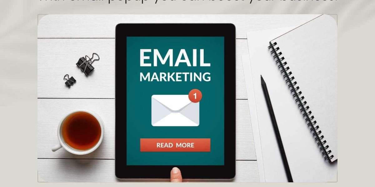
Email Popup is a powerful tool to increase website conversions, build your lead base, and collect useful information. However, it should be used carefully as it can be intrusive and distracting to the visitor. To avoid this, it’s important to create a high-converting email popup that is in line with the rest of your site and makes sense to your target audience.
Email Signup Forms
The best email subscription forms are straight to the point and offer a clear benefit to subscribers in exchange for their email address. Some examples include offering discounts, free shipping, or a chance to win a prize in return for their contact details.
Bean Box is a coffee subscription service that offers new subscribers a $5 voucher to spend on their coffee if they subscribe. The form makes this offer very clear to the user by using bold fonts and an eye-catching color scheme to attract their attention and promote the benefits of subscribing. This form also mentions in the text that subscribing to their newsletters makes the subscribers part of a “community,” which gives them a sense of belonging that makes them more likely to subscribe.
Effective
Kombucha Shop is another example of a slick, simple, and effective email signup form that highlights the products on their website and explains why they should sign up to their newsletter. The color scheme of the form is in line with their brand so it looks professional and focuses on the product rather than the signup form itself.
Make Sense of Cents uses a popup to offer visitors a free ebook in exchange for their email address. The ebook is relevant to their audience, so it makes a good choice of incentive.
The title and graphics of this email form explain the benefits of signing up, and it features a green call-to-action button that stands out from the rest of the popup. In addition to that, the ebook is a high-value, free resource that can help your subscribers feel more confident about investing their time in subscribing.
Similarly, clothing retailer Chubbies keeps their email signup form very simple and straightforward. The form requests a customer’s email address and in exchange, offers a 15% discount on their first order. This is a good strategy to encourage customers to subscribe to your mailing list as they are most likely visiting the website with a purchase in mind.
Farfetch shows another good email signup form that allows visitors to choose whether they want to receive information by email or phone and, if desired, to only receive news from the company that they’re interested in. This makes it easier for the company to tailor their marketing messages to suit their audience and avoid sending them irrelevant content.
In a similar way to the other email popup above, this form uses a bright and vibrant color scheme that is in line with the brand’s identity. The form is also positioned on the lower right-hand side of the page so it is not distracting and doesn’t take up space when the customer is browsing.